Pair Prototyping
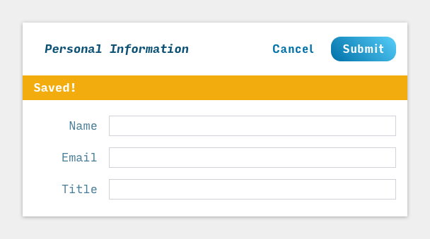
When I started working full-time Onvia, we worked on an account page; simple stuff, a user can see their details and update them. One mock our dev team was handed was simple, 4 card components displaying the information with a toggle to switch it into a form to update the info. Interactions were very minimal, because the point of this particular view was to be information dense, providing the user with information about not only their profile, but their subscription information and tailored contact information.
But the place we were struggling with was giving users meaningful feedback after they performed their given action, cancel or update. So we iterated on the fly. The initial mock was mostly showing the distinct two views (default and editing) but not the interaction. I like calling this type of thing pair prototyping. Like pair programming except you both do something other than check Twitter.
A more dedicated UX designer and I sat down, I pulled up the initial set of components in a browser. They pulled up Sketch. We’re using React so the logic never really had to change and we could choose what to render. The logic was simple, if edit is true, render the form with the same props that were used for the default card view, submitting fires a post request, if the response is successful, show an indicator and switch edit to false to switch back the default card view. We focused on what we could render, since we isolated the <SuccessIndicator /> into a single component we could change it to essentially whatever we liked given.
The UX designer could see the code I was writing and since it’s Sass (yea we’re using Sass, for reasons…bad ones), it was easy to call out what UI styles needed to change. At the same time, I was able to give them feedback in a real browser context, they could also see these iterations done in real time via some hot module replacement.


Collaboration like this goes back to what I was talking about in my previous post. Feedback, mutual respect, meaningful interaction, done in practice. More often than not, when we’re able to use this type of dynamic in prototyping, we end being more confident in the product we’re deploying and get to the results much quicker.
Typically I work with what we’ll call an “embedded teams”. A single team is comprised of members of the engineering team, two front-end, two back-end, a product manager and a dedicated UX designer. In an ideal world, this collaboration can happen very easily with the given dynamics, but it’s not always easy. It’s part of my focus to lower that barrier to entry. As we’re sprinting as an engineering team we have access to resources to deliver the user stories we’re committed to (…we’re agile…I really just want to be spry, that’s so much better of a word, it’s lively but less acrobatic), but what ends up happening is our backlog is in a constant state of flux with priorities shifting (which in a business focused on delivering value that’s what should happen). As a result, it’s anything goes and this collaboration becomes imperative versus it being a luxury.
I like self-induced pandemonium. It’s like eating leftover Chinese food first thing in the morning, something bad is inevitably going to happen, and instead of dodging the bullet you learn very quickly how to live with shrapnel. Ya ummm, this analogy is getting away from me.
But anyway, there’s this echoing idea in this industry, that UX is everyone’s concern; from back-end engineers, to front-end developers, to salespeople. But this idea is useless if it’s not put into practice.